Design Portfolio
Our Mission Is To Create Stellar Packaging That Works Effectively Across Media, Experiences And Platforms
We tap into your passion, to generate bold creative that shifts the mindset of consumers and encourages trial.
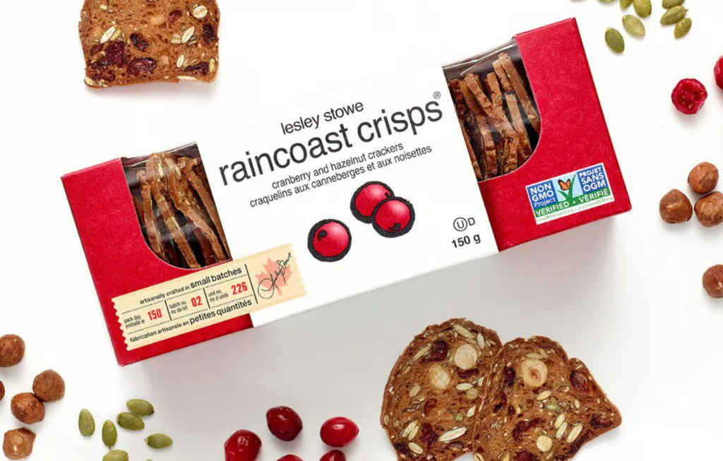
Leslie Stowe
Brand: Raincoast Crisps
Category: Premium Crackers
- Graphic Design
- Structural Design
- Branding
Leslie Stowe Raincoast Crisps: Handcrafted Crackers Made with the Finest Natural Ingredients.
The crackers are all about simplicity and authenticity. They're lovingly made in small batches using the best natural ingredients. We've designed the packaging to reflect these values in a more understated way.
Our packaging features a natural, uncoated look with earthy colors, bringing a touch of rustic charm. The simple illustrations and font choices we've made emphasize the straightforward and artisanal nature of our product.
More Family Brands (US)
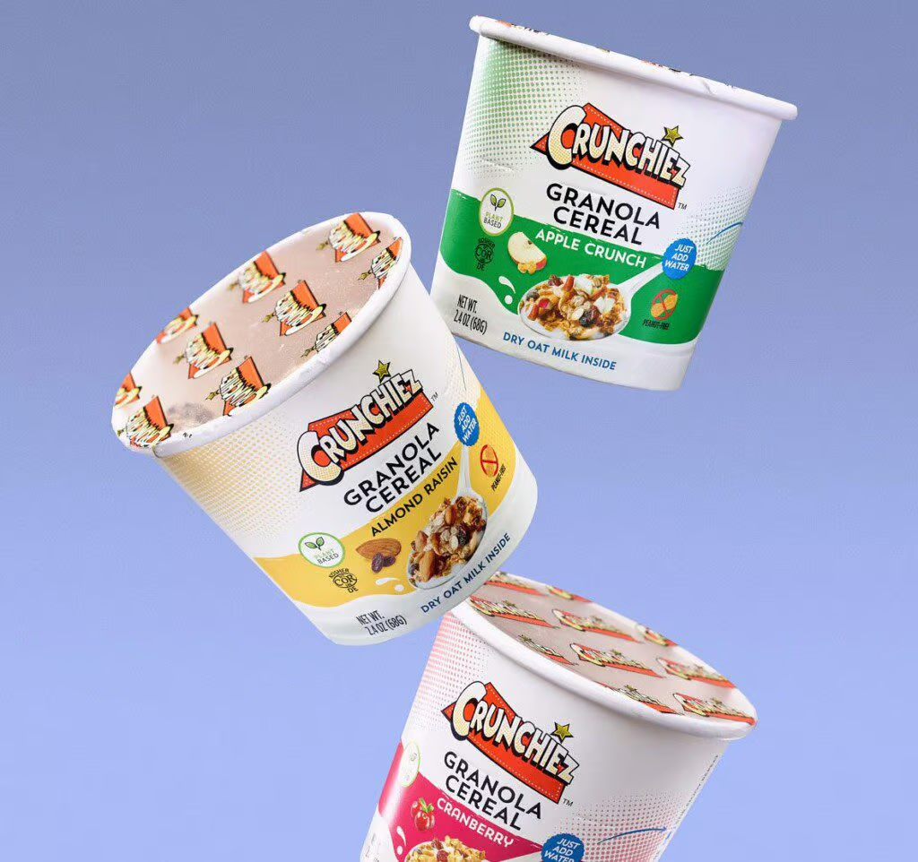
Brand: Crunchiez
Category: Snacks
- Graphic Design
- Structural Design
- Branding
More Family Brands has redefined the concept of on-the-go breakfast with the introduction of Crunchiez, an instant granola breakfast that requires just a quick addition of water, a simple stir, and you're ready to enjoy it. Ideal for those of us who seem to be chasing the elusive 30-hour day.
Our packaging features a recyclable paper bowl sealed with a branded film membrane. Geared towards a younger audience and influenced by the style of comic books, this product line is swiftly gaining popularity across the US market, winning over new fans with every trial.

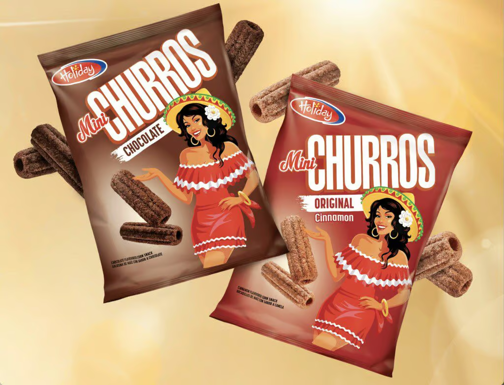

Holiday Snacks (Trinidad)
Brand: Mini Churros
Category: Snacks
- Branding
- Design
- Spokes Character development
Holiday Snacks proudly holds its position as Trinidad's leading brand for traditional snack products. With the exciting introduction of the new Mini Churros line, the aim is to break free from the conventional expectations of the snack category. The packaging not only represents Trinidadian joy of life, but also goes beyond being just another snack, creating an experience that celebrates their vibrant culture.

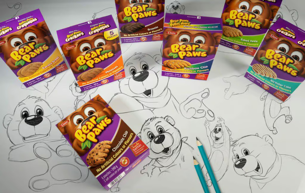

Dare Foods (Canada)
Brand: Bear Paws
Category: Children’s Cookies
- Branding
- Design
- Segmentation
- Spokes Character development
- V-Shopper Optimization
In the Canadian market, Bear Paws stands as the reigning favourite, cherished by both children and mothers.
Our design approach centers on leveraging the enduring "eye-connection" principle through our amiable mascot to captivate shoppers as they navigate the store's aisles.. The product range includes a delightful assortment of healthy, on-the-go snacks in various enticing options. To simplify the shopping experience we've implemented a colour-coded system along with descriptive names for each segment of the Bear Paws product family, ensuring that selecting the perfect treat is as effortless as savoring one.

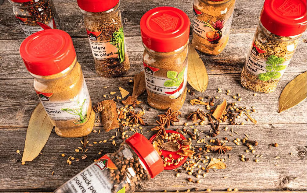
McCormick (Canada)
Brand: Club House Spices
Category: Culinary Spices
- Brand Design
- Package Redesign
In our goal to encourage trial and to achieve brand preference in a fiercely competitive category, we harnessed the power of the iconic Club House brand assets and selected a vibrant color palette to distinguish the brand and increase visibility.
Our material selection process led us to choose a unique shrink-wrap substrate boasting an impressive 98% clarity. This innovation was aimed at providing consumers with a crystal-clear view of the spices' freshness within every jar. Our goal was to transform the perception of the Club House brand from being a mere supplier of ingredients into a brand that inspires culinary creativity and awakens the senses.
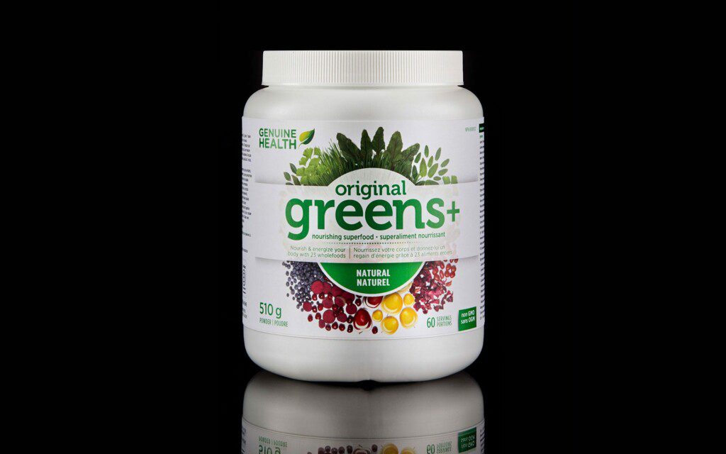

Genuine Health (Canada)
Brand: Various
Category: Supplements
- Brand Design
- Corporate ID
- Package Redesign
Genuine Health has proudly stood as one of Canada's premier supplement brands, dedicated to pioneering research, formula validation, and establishing credibility within the natural health industry since the mid-'90s.
Our design mission was to revitalize the brand, enhancing its visibility on the shelf and encouraging greater trial among consumers.
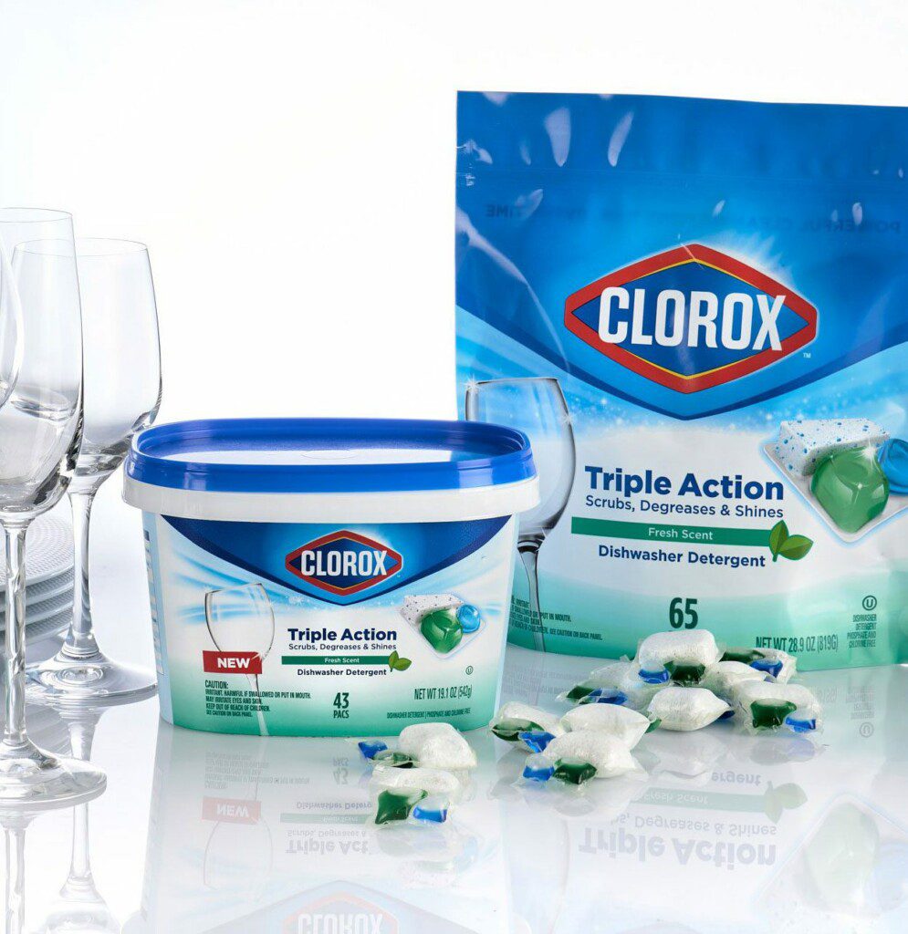

Clorox (US/Canada)
Brand: Clorox
Category: Automatic Dish Detergent
- Branding
- Label design
- Structural
There's nothing quite like the gleam of a spotless glass to signify truly clean dishes.
This concept served as the driving force behind the development of Clorox's dishwasher detergent. Given Clorox's well-established reputation for effective cleaning and germ-fighting capabilities, our virtual store test platform underscored the considerable impact of Clorox's brand recognition in driving purchases among category shoppers.
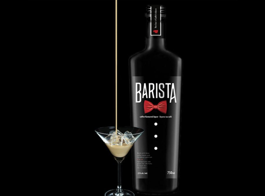

Mondia Alliance (Canada)
Brand: Barista
Category: Coffee Liqueur
- Branding
- Label design
- Structural
Barista Coffee Liqueur boasts a rich and unique flavor derived from the finest Arabica coffee beans and all-natural extracts.This exceptional taste served as the catalyst for a daring and sophisticated design, drawing inspiration from the attire of a skilled barista and aligning seamlessly with the brand's identity.
The distinctive branding is purposefully crafted to enhance shelf presence and ensure maximum visibility behind the bar.

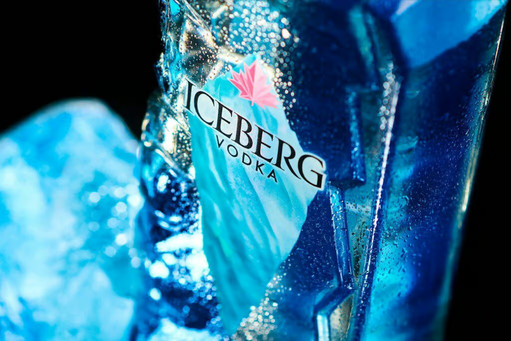
Iceberg Vodka (Canada)
Brand: Iceberg Vodka
Category: Vodka
- Branding
- Label design
- Structural
Iceberg Vodka is meticulously crafted in small batches using iceberg water, renowned as the purest water source on Earth, harvested along the pristine coast of Newfoundland.
We undertook an extensive brand transformation initiative to rekindle the brand's distinctiveness and enhance its perception of "premium quality," showcasing it as one of Canada's finest vodkas in terms of taste and craftsmanship.
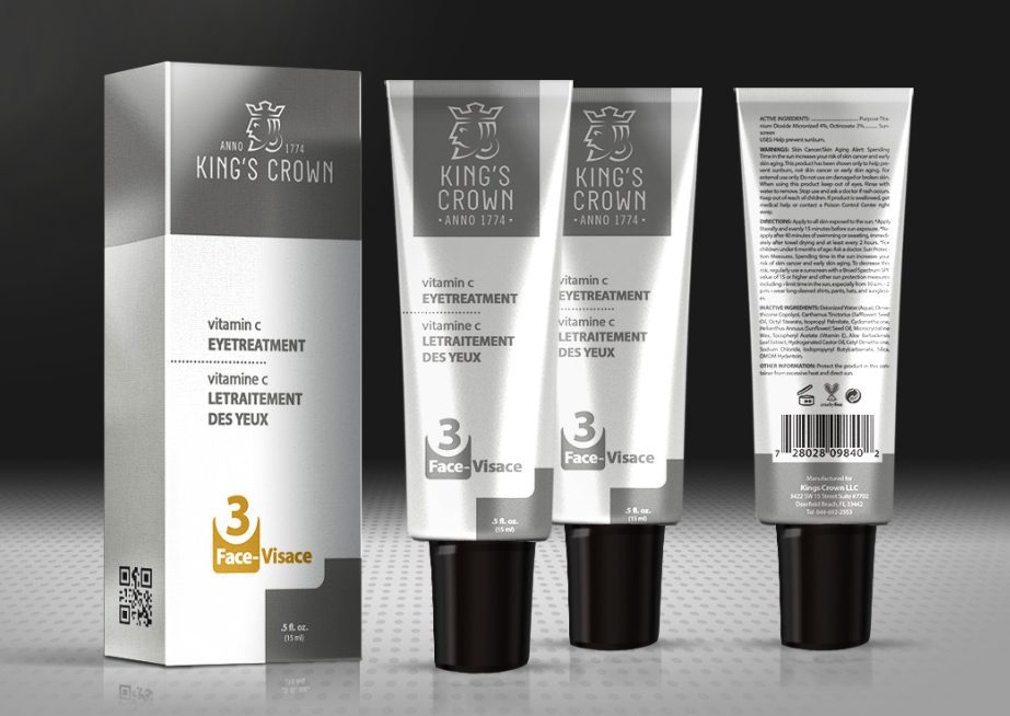
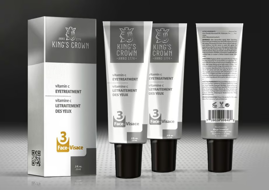
King’s Crown (Canada)
Brand: King’s Crown
Category: Men’s Grooming
- Corporate ID
- Label design
- Nomenclature
- Structural
In the tradition of Gebrüder Weyersberg™, esteemed makers of Europe's finest swords in Solingen, Germany, King’s Crown™ carries forward their legacy as a direct descendant.
With the era of swords giving way to the growing demand for men's grooming products tailored to their distinct preferences, the Weyersberg family made a seamless transition into crafting straight razors.
Marovino was entrusted with the task of crafting a corporate symbol that pays homage to the rich history and family heritage, all while exuding a forward-looking sophistication and functional simplicity for the packaging system.
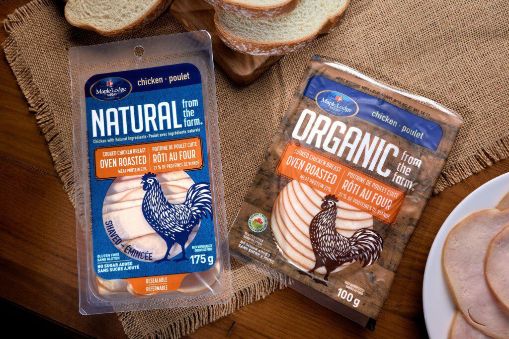

Maple Lodge Farms (Canada)
Brand: NATURAL from the farm
Category: Deli
- Brand Design
- Label design
- Structural
Sliced deli chicken is a lunch-time classic in Canada.
The evolved NATURAL from the farm got a new logo that is distinctive and inspired by the local farmer’s market. Modern typography, bold illustrations and clear hierarchy define the new brand look as distinctive and fresh.
Ultimately Marovino extended the new design language across the entire line of Deli products.
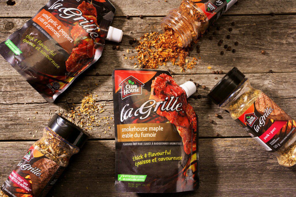

McCormick (Canada)
Brand: La Grille
Category: Wet Rubs
- Brand Design
- Package Design
Where there’s fire, there’s favour…
Club House spices are Canada’s leading brand in the fresh spice category. The brand’s ambition was to continue growing through innovation and attracting new audiences.
To give the brand permission to enter new spaces and to attract new users, the brand needed to move beyond traditional spice usage and appeal to a broader audience with flame-grilling and present a stronger narrative with a memorable and distinctive visual identity.

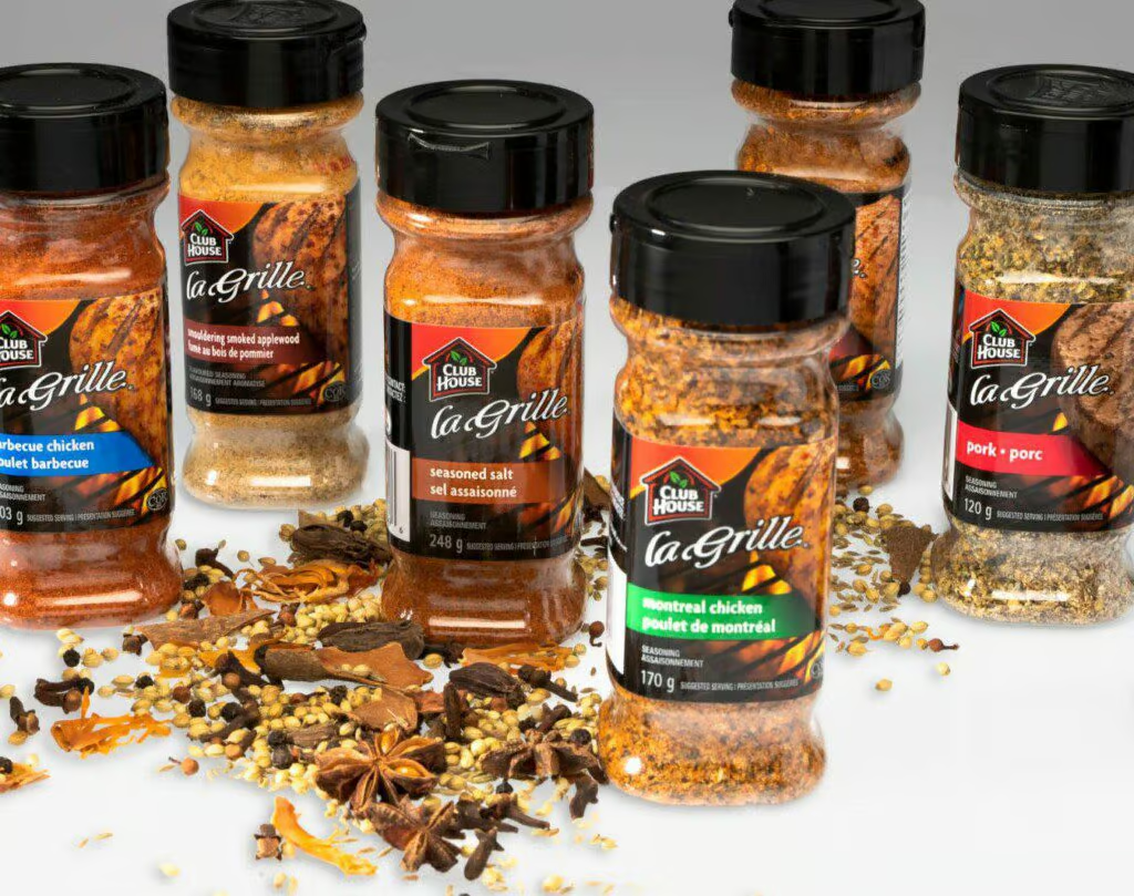
McCormick (Canada)
Brand: La Grille
Category: Dry Rubs
- Brand Design
- Package Design
For flavour inspiration and grilling creativity, the world turns to McCormick for expertise. They were looking to drive brand preference and trial across the La Grille brand portfolio.
We resorted to rich dark colours and textures to encourage foodies to expect the best out of home cooking, shifting perceptions of McCormick as a quality yet functional ingredient to one that inspires culinary creativity and stimulates the senses.
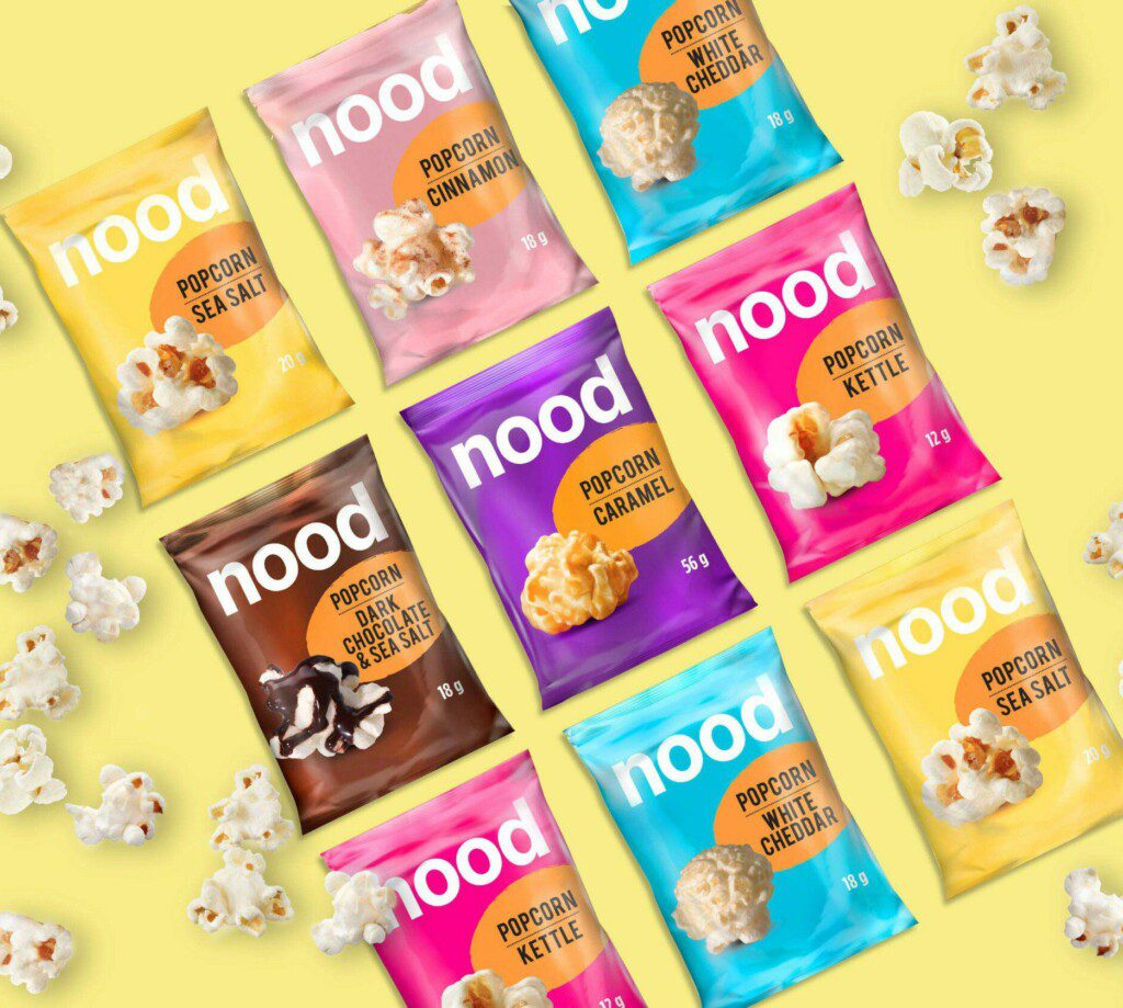

Soldanza (Costa Rica)
Brand: Nood
Category: Snacks – Popcorn
- Brand Design
- Package Design
Popcorn perfection in every way!
The vibrant colours play with the senses in anticipation of the available flavours.
The brand identity expresses an unapologetic and bold approach. This inspiration allowed us to create a minimalist design that represents the brand’s simple unpretentious personality and delicious favour.

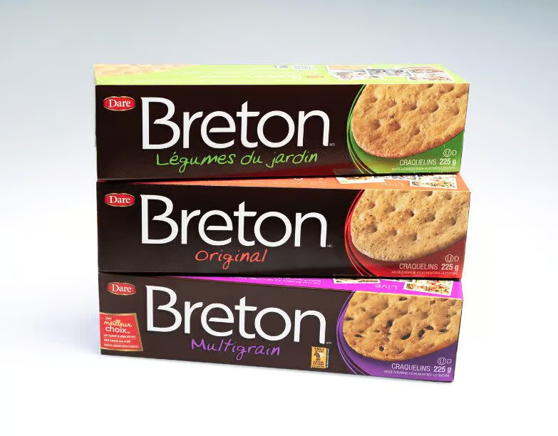
Dare Foods (Canada)
Brand: Breton
Category: Crackers
- Brand Design
- Segmentation
- Package Design
Breton, Canada’s best selling cracker, celebrates 40 years of success. It is considered to be a perfect companion to a variety of toppings.
The long distinctive box presented an ideal canvas for displaying the brand at full strength for maximum visibility and brand blocking on shelf.
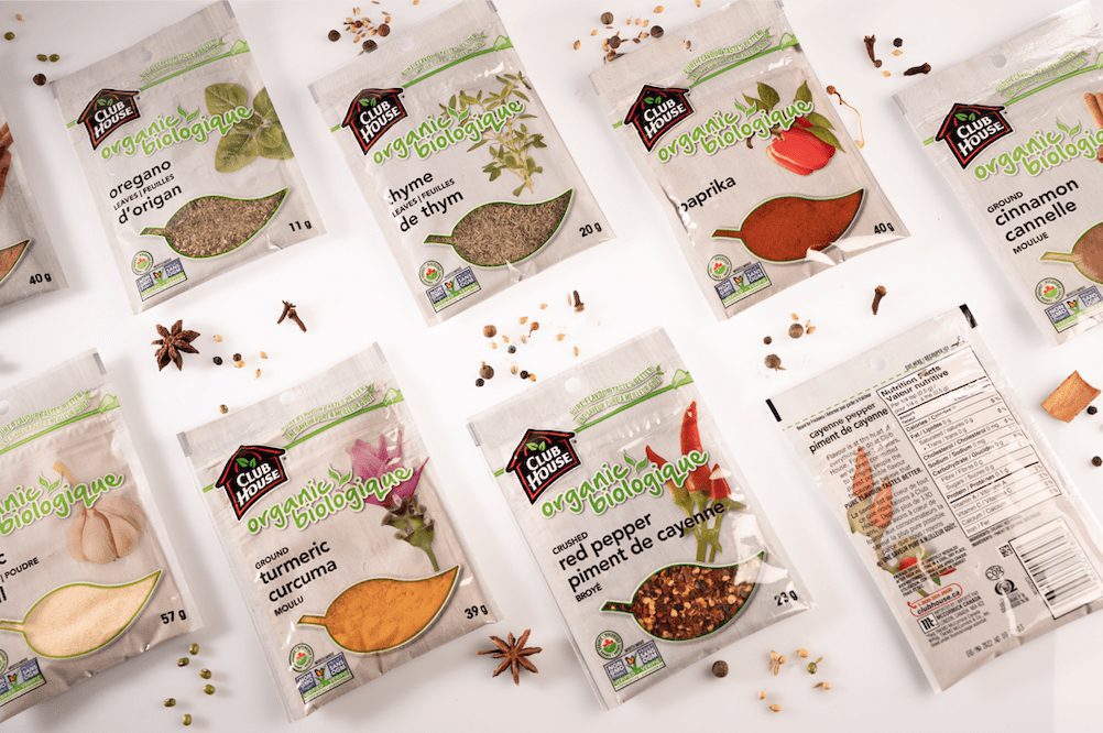

McCormick (Canada)
Brand: Club House
Category: Organic Spices
- Brand Design
- Package Design
Club House’s ambition is to continue growing through innovation and to attract new audiences. To give the brand permission to enter new spaces and to attract new users, the brand needed a strong narrative with a memorable and distinctive visual identity.
Bold illustrations and clear hierarchy define the new look as distinctive, modern and fresh.
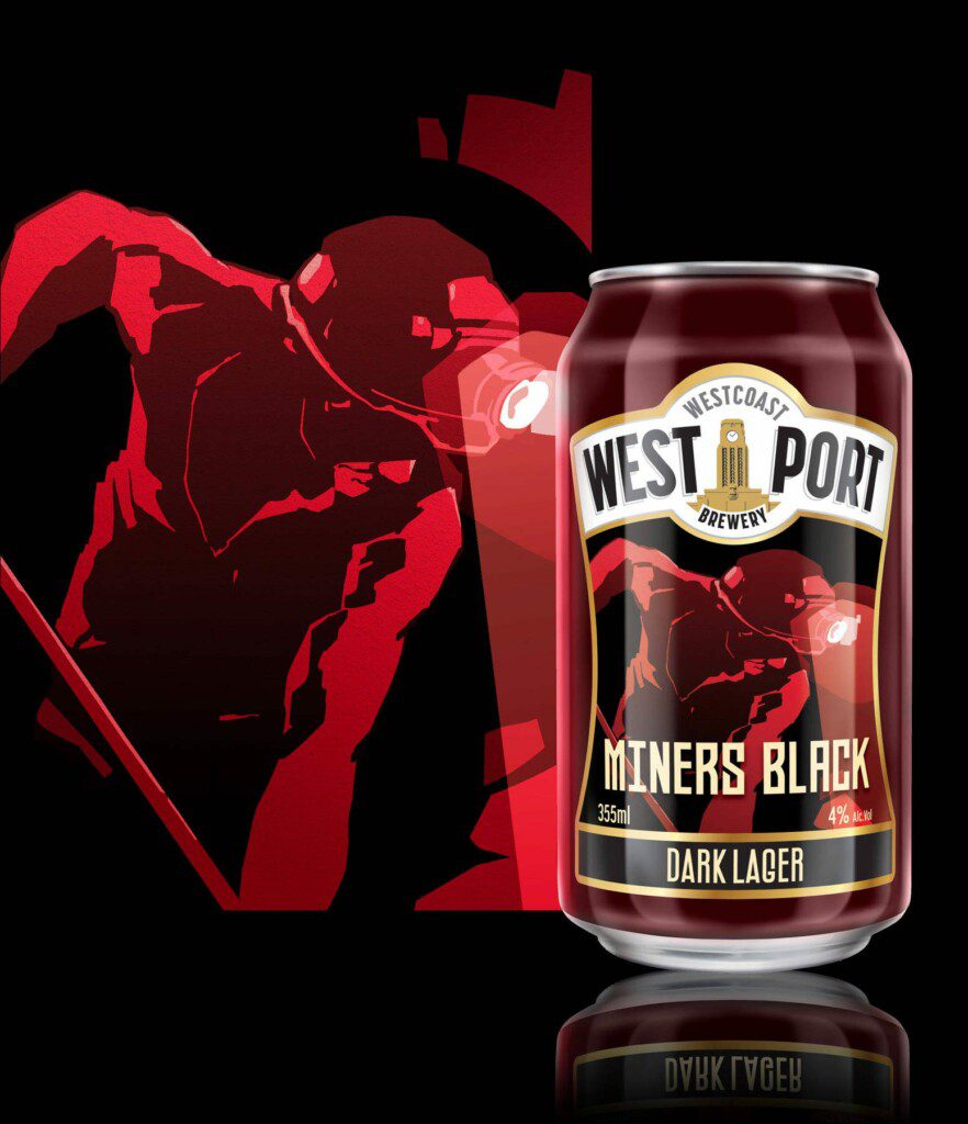


West Coast Brewery (New Zealand)
Brand: Westport
Category: Organic Beer
- Brand Design
- Corporate ID
- Package Design
Miners Black is batch brewed at the West Coast Brewery in New Zealand. Their Original brew quenched the thirst of coal miners that worked the coal seams until the late 20th century.
The beer continues to celebrate the lives and rich history of the coal miners and their industry, which was the foundation of the local economy.
Marovino was asked to design a label reflective of the toil and hardship of the miners and to encourage discovery and acknowledgement. We set out to capture the brand’s spirit of realness with a new identity that embraces an authentic nothing-to-hide brand aesthetic.
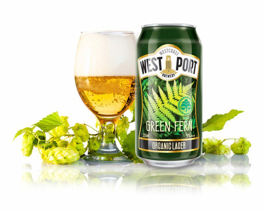
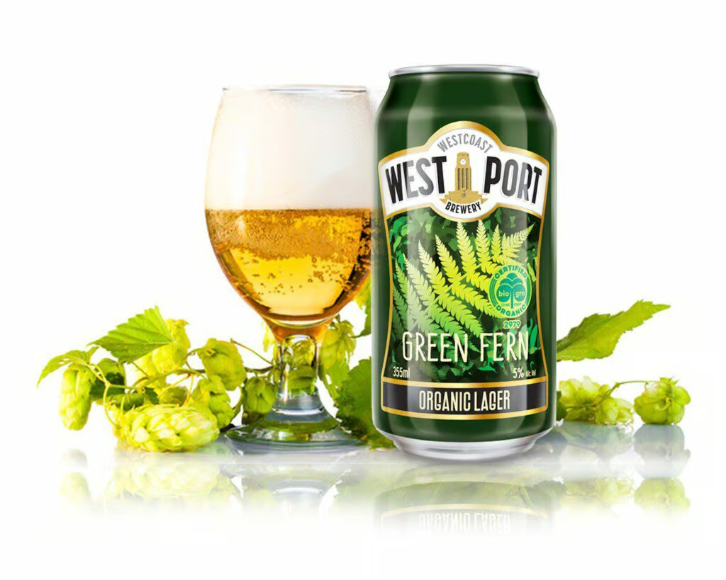
West Coast Brewery (New Zealand)
Brand: Westport
Category: Organic Beer
- Brand Design
- Corporate ID
- Package Design
This crisp, dry organic lager has a subtle lemon kick with a clean finish. It pairs well with beaches, barbecues, and backy and cricket.
New Zealand is known for its pristine nature and particularly for the fern, which is the national symbol of the country.
We designed the brand with those trademarks in mind. Green Fern Lager is the ambassador beer of New Zealand to the world.
Interested in a few tips on how to make your Package Design work harder?