You’ve updated your packaging and now sales are in decline…
According to research from Perception Research Services, “It is far easier to damage a brand than to grow it via packaging design. In fact it’s about twice as likely, as approximately 20% of new packaging systems drove declines in purchases from the shelf – as opposed to the 10% that drove sale increases.” (Winning at the two moments of Truth. Quirk’s Marketing Research Review. Jan 2010)
A brand’s value or equity is dependent on people’s perception of it. Building these perceptions can take many years, as a brand’s reputation is built by repeated proof that it deserves the consumer’s trust. The visual properties that consumers associate with the brand are an integral part of brand equity. One could argue that in consumers’ minds they are the brand. When marketers make changes to the appearance of the brand, they risk cutting the chords of familiarity with consumers which will affect their perception of the brand, their ability to find it on shelf and may re-introduce competitive brands as part of the purchase consideration.
As consumers’ tastes and expectations evolve, brands also have to evolve. Understanding and managing a brand’s visual properties during a design change will prevent self-inflicted sales erosion. Even some of the best marketing minds can at times get too far ahead of consumers with their packaging changes, leaving consumers in the dust and paying dearly with loss of sales, market share and consumer loyalty. The Tropicana redesign of 2009 and Coca Cola’s Christmas pack of 2011 are some of the more notable examples.
Visual brand properties are the main link between consumers and your brand
90% of all transmitted information to our brain is visual. Brands exist in our minds mainly as visual snapshots. They are the Visual Brand Properties that connect brands to consumers. In 2012 consumer connectivity was the headline for consumer trends. In 2014 the headline read: “Content is king!” Today the new horizon is the digital experience: AR (Augmented Reality) and VR (Virtual Reality) are expected to be the new frontiers of consumer experience. The core element? Visual content.
Visual images are already the content of choice for Facebook, Pinterest, YouTube and other social media platforms. So why is it that marketers invest hundreds of thousands of dollars getting their packaging system “right” and then seemingly throw caution to the wind when updating their packaging, creating promotional packages or web pages using a completely different playbook, with little or no concern for Visual Brand Properties?
Visual Brand Properties reside with consumers but are stewarded by the brand owner
Typically, the visual cues provided by the design of the packaging become the residual visual cues that consumers will use to identify the brand. In a recent study that we conducted with over 3,000 category buyers, brand recognition of challenger brands doubled when consumers were shown the package.
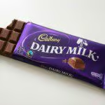
The importance of identifying and protecting these visual cues is not lost on some brand owners who spend millions of dollars in trademark and trade dress protection. One of the most notable examples is Mondelez’s efforts to protect Cadbury’s Pantone 2685C vs. Darell Lea Confections in Australia; Cadbury vs. Stollwerk, Poland; and Cadbury vs. Chocolates Bariloche, Argentina.
And you aren’t likely to find Pantone PMS 1837 in any Pantone Matching System swatch book. That’s because it isn’t publicly available as the colour is trademarked by Tiffany & Co.
Simple but effective solution
Throughout the years, we have asked consumers to perform a very simple exercise to help us identify brand properties. We asked them to draw a picture of “their” brand. When asked to do so, consumers intuitively keyed in on colours, logos, word-marks and shapes. Colours and logos are typically the strongest mnemonic. Our results show that most brands will have more than one visual cue. We have also noticed that brands with lower top-of-mind awareness are recognized not by a single visual cue but by the gestalt of the entire package (no Identifiers, but several Contributors).
If you are a brand owner considering updating your packaging how do you know which visual elements play a role in distinguishing your brand? For the past twenty years we have used a very simple formula to group all visual elements into three buckets. The first two groups identify the elements that are most significant in maintaining a degree of recognition (Familiarity) that will help to bridge any transition, whether it is a brand name transition, or a substantial re-fresh where you might risk losing existing brand ‘loyals’ if they can’t find the new design on shelf.
The third bucket identifies those elements that don’t play a significant role in retaining recognition. This is a simple chart to illustrate:

IDENTIFIERS
Visual elements that identify your brand without the help of any other element
Unique to your brand and Trade mark-able

CONTRIBUTORS
Visual elements that contribute to the identification of the brand but do not succeed in doing so entirely on their own.
May not be unique only to your brand. Cannot be a functional part of your product

PASSENGERS
Visual elements that perform functions not related to brand identity ie. flavour, size, features and claims.
Category Conventions, read more…
From Electrasol to Finish
When Reckitt Benckiser asked us to transition Electrasol (Domestic brand) to Finish (Global) our research showed that consumers strongly associated the stem glass with Electrasol. However, when we showed only the stem glass to a separate group of consumers, very few were able to link it to Electrasol. Although the glass and the blue background are Contributors not Identifiers, the glass’ strong association to the brand was considered a very important element to retain familiarity and help bridge the brand transition from Electrasol to Finish.
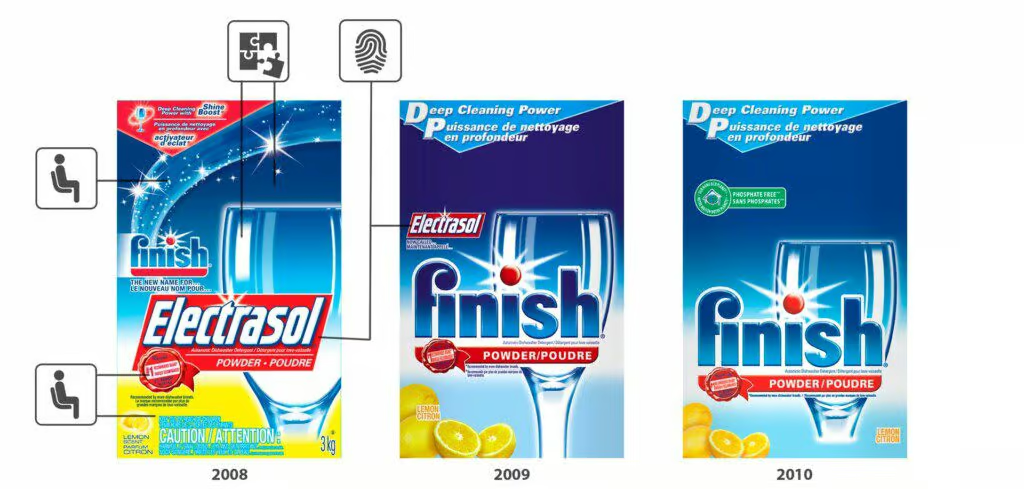
After several years of adhering to their Brand Properties, Finish has garnered sufficient familiarity with consumers that it could safely expand its segmentation under a cohesive visual umbrella and clear segmentation.

So what went wrong with Tropicana?
When Tropicana launched their new packaging in 2009 their sales immediately dropped by 20 percent. The new design failed on several fronts. The most egregious fail was the complete elimination of the Identifiers – the word-mark and the orange with the straw. This design could just as easily have been for a private label brand. There was nothing to assist consumers in linking the new packaging to the Tropicana brand. The chords of familiarity were completely severed.
When consumers looked for their familiar Tropicana package – they couldn’t find it within the few seconds that they were willing to spend looking for it.
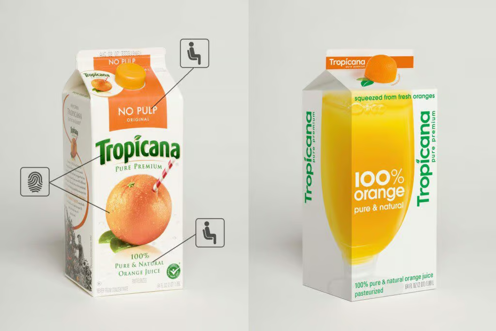
Our Visual Diagnostics research tool demonstrates that within 1/3 sec, the average shopper will notice a brand and be able to decide whether it should be part of the purchase consideration set or not. The redesigned Tropicana package had nothing that would trigger recognition within that time frame, therefore it wasn’t seen by many consumers who were scanning the shelves for their familiar brand. Not seen, not bought.
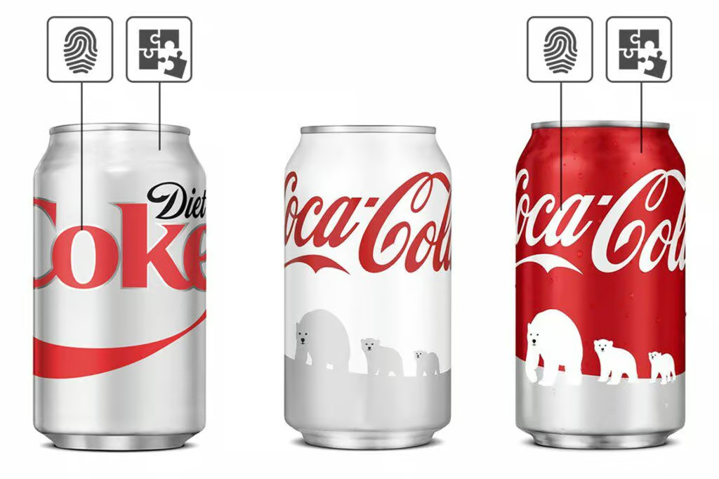
When Coca Cola introduced its 2011 Christmas pack they didn’t take into consideration the visual properties of their two iconic brands: the red can stands for regular Coke, the white can stands for Diet Coke. That is how millions of Coke drinkers identify ‘their’ Coke. When Coke launched their special Christmas pack promoting their support of the World Wildlife Fund, they sought to create a disruptive package, and they succeeded. However, they also created confusion and frustration with Diet Coke drinkers who were picking up the package thinking that they were picking up Diet Coke…white background, red branding? Must be Diet Coke! One month later Coca Cola reprinted 1.2 billion cans of regular Coke, with a red background.

Marovino specializes in Brand Strategy, Shopper Behavior Research, Brand Identity, Package Design, Consumer insight, Category Benchmarking, Brand Segmentation, Brand Architecture, and Brand Standards.
We are recognized as one of the Top Packaging Design Companies by DesignRush.

